Python Nmon Analyzer: moving away from excel macros
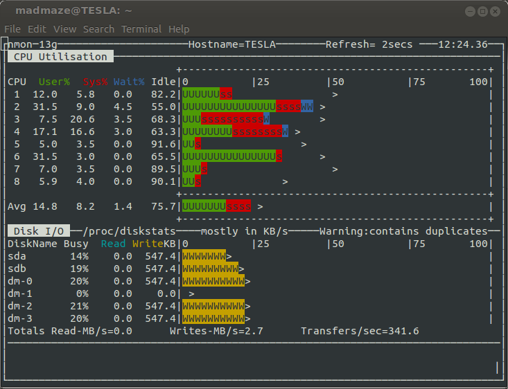
Nigel's monitor, dubbed "Nmon", is a fantastic tool for monitoring, recording and analyzing a Linux/*nix system's performance over time. Nmon was originally developed by IBM and Open Sourced in the summer of 2009. By now Nmon is available on just about every linux platfrom and architecture. It provides a great real-time command line visualization of current system statistics, such as CPU, RAM, Network and Disk I/O. However, Nmon's greatest feature is the capability to record system performance snapshots over time.
For example: nmon -f -s 1.
This will create a log file starting of with some system metadata(Section AAA - BBBV), followed by timed snapshots of all monitored system attributes, such as CPU and Memory usage. This produces a file that is hard to directly interpret with a spreadsheet application, hence the birth of the Nmon_Analyzer excel macro. This tool is great, if you have access to Windows/Mac with Microsoft Office installed. If not there is also the Nmon2rrd tool, which generates RRD input files to generate your graphs. This is a very rigid approach and slightly painful. Now to provide a more flexible tool, I am introducing the pyNmonAnalyzer, which aims to provide a customization solution for generating organized CSV files and simple HTML reports with matplotlib based graphs.
Getting Started:
System requirements:
As the name indicates you will need python. Additionally pyNmonAnalyzer depends on matplotlib and numpy. If you are on a debian-derivative system these are the packages you'll need to install:
$> sudo apt-get install python-numpy python-matplotlib
Getting pyNmonAnalyzer:
Either clone the git repository:
$> git clone git@github.com:madmaze/pyNmonAnalyzer.git
or
Download the current release here: pyNmonAnalyzer-0.1.zip
Next we need an an Nmon file, if you do not already have one, either use the example provided in the release or record a sample: nmon -F test.nmon -s 1 -c 120, this will record 120 snapshots at 1 second intervals to test.nmon.
Lets have a look at the basic help output:
$> ./pyNmonAnalyzer.py -h
usage: pyNmonAnalyzer.py [-h] [-x] [-d] [-o OUTDIR] [-c] [-b] [-r CONFFNAME]
                         input_file

nmonParser converts Nmon monitor files into time-sorted
CSV/Spreadsheets for easier analysis, without the use of the
MS Excel Macro. Also included is an option to build an HTML
report with graphs, which is configured through report.config.

positional arguments:
  input_file            Input NMON file

optional arguments:
  -h, --help            show this help message and exit
  -x, --overwrite       overwrite existing results (Default: False)
  -d, --debug           debug? (Default: False)
  -o OUTDIR, --output OUTDIR
                        Output dir for CSV (Default: ./data/)
  -c, --csv             CSV output? (Default: False)
  -b, --buildReport     report output? (Default: False)
  -r CONFFNAME, --reportConfig CONFFNAME
                        Report config file, if none exists: we will write the
                        default config file out (Default: ./report.config)
There are 2 main options of using this tool
- Turn the nmon file into a set of separate CSV file
- Generate an HTML report with matplotlib graphs
The following command does both:
$> ./pyNmonAnalyzer.py -c -b test.nmon
This will create a directory called ./data in which you will find a folder of CSV files ("./data/csv/"), a folder of PNG graphs ("./data/img/") and an HTML report ("./data/report.html").
By default the HTML report will include graphs for CPU, Disk Busy, Memory utilization and Network transfers. This is all defined in a self explanitory configuration file, "report.config". At the moment this is not yet very flexible as CPU and MEM are not configurable besides on or off, but one of the next steps will be to refine the plotting approach and to expose more flexibility with which graphs plot which data points.
Report Example:

Currently these reports are very bare bones and only prints out basic labeled graphs, but development is on-going. Currently in development is a wizard that will make adjusting the configurations easier. Please do let me know if you have any suggestions, find any bugs or have feature requests.